08
Ledger
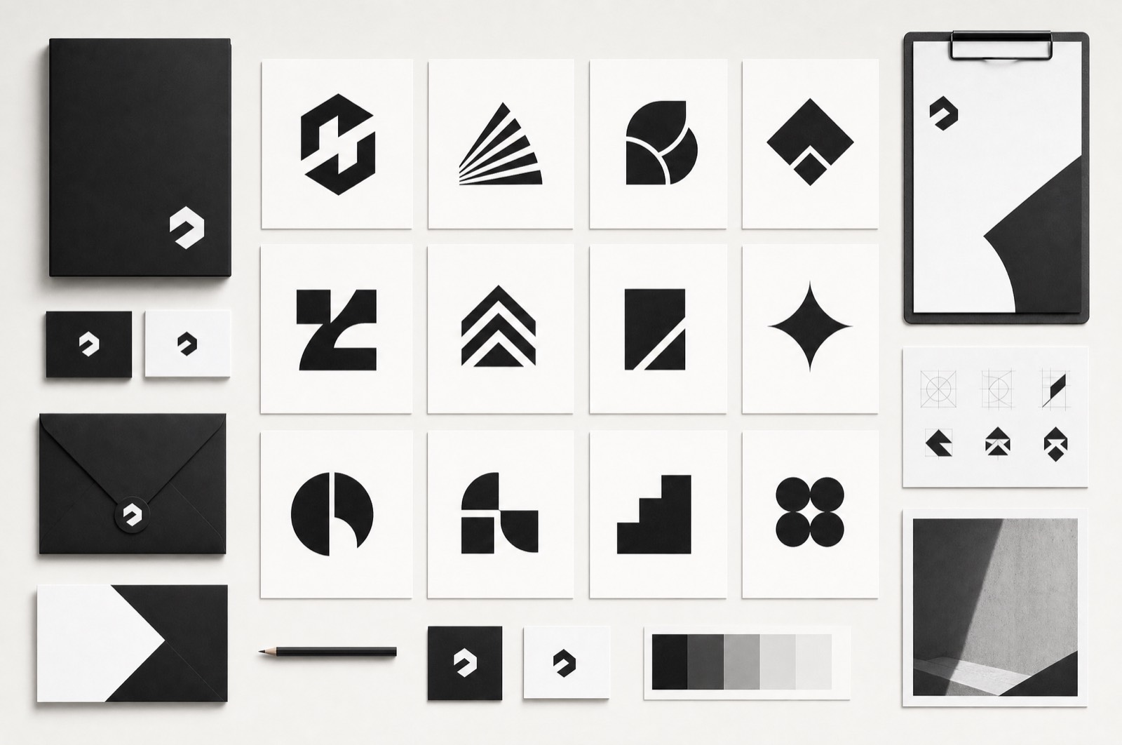
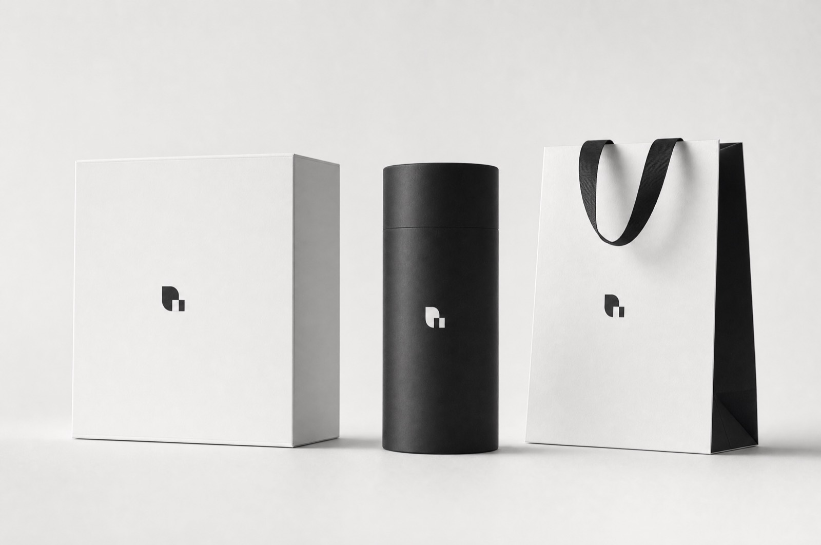
Stationery for an accountancy practice that wanted to look like neither a bank nor a startup.
- Client
- Ledger & Co.
- Year
- 2022
- Role
- Identity and print
- Deliverables
- Stationery, print specification
Brand collateral
Two ends of this category are well served: the marble-and-serif establishment look, and the friendly startup with a wordmark in a rounded sans. Ledger wanted the middle, which nobody makes because it is harder to brief.
Quiet, not cold
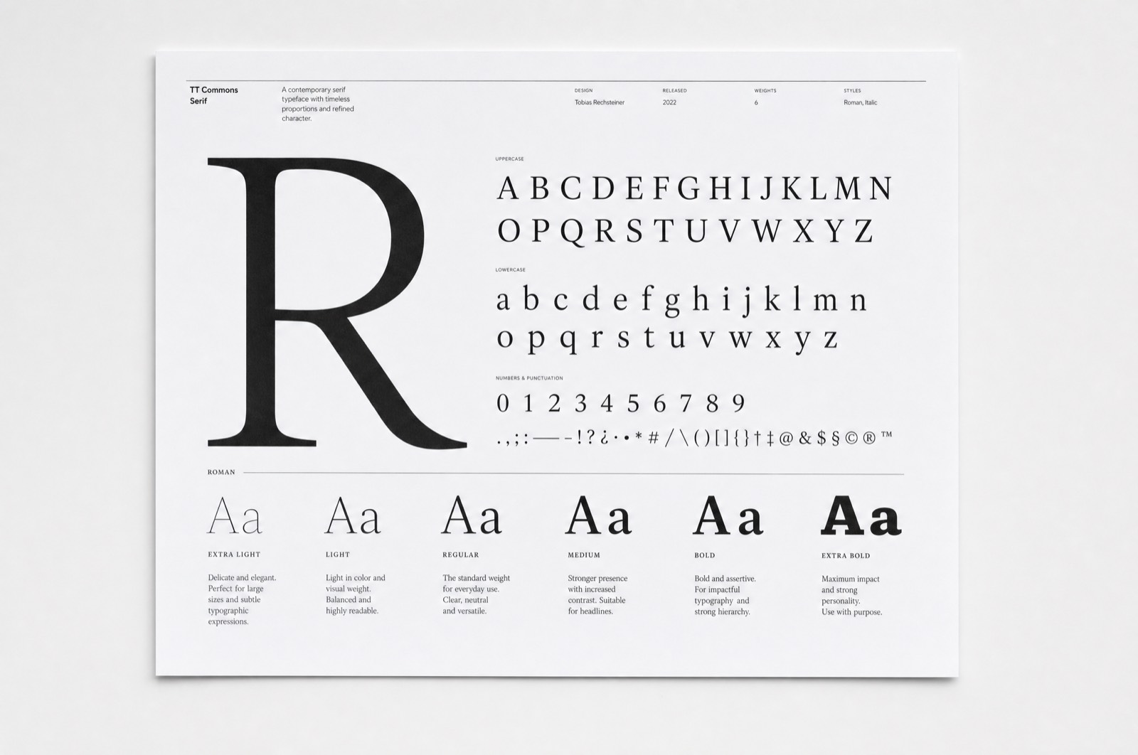
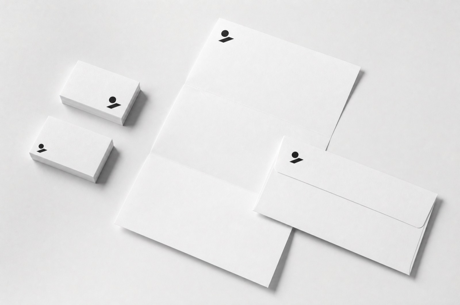
The whole system is one mark, one weight of one typeface, and a great deal of paper. What stops it reading as austere is the stock — a warm, slightly toothy uncoated sheet that takes ink softly and feels handled rather than issued.
Print decides it
The cards are letterpress, one hit, deep enough to feel on the reverse. That single decision does more for how the practice is perceived than any amount of visual identity, and it cost less than the photography they had budgeted for and did not need.
Small system, long life
Four printed items and a one-page specification. Four years on it has not been revised, which for a practice of that size is the right outcome — the work was to make something they would not need to think about again.